Case Studies/UZAPOINT

Reimagining retail operations across Africa.
If you walk into any retail outlet in Kenya, the chances are the shop assistant will be using the software that I helped reimagine — intentionally designed for retailers serving a market of over 50 million customers annually.
Timeframe
8 months
Location
Hybrid, London UK
Engagement
Client-side Contract
Role
Product Designer
Introduction
Who are Uzapoint?
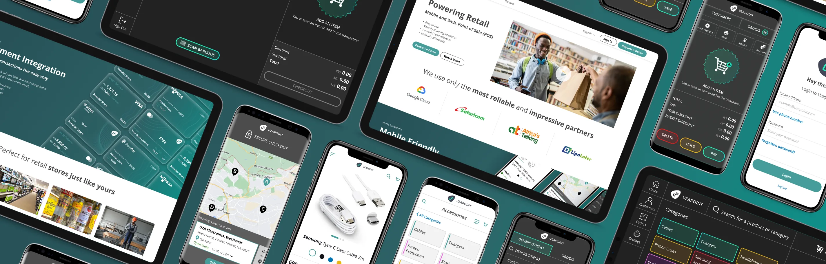
Uzapoint are a smart alternative to traditional SME management systems, offering a way to streamline operations without the usual hassle. Seeing the potential for significant impact, I embraced the challenge to revitalise their digital presence by immersing myself in the Uzapoint culture, working closely with the team and senior business stakeholders based in Nairobi, Kenya. With more than 50,000 businesses powered by Uzapoint across 10+ high-growth African markets, the platform has become a key player in helping retailers exceed their goals through enhanced efficiency and productivity.
50K+
Businesses powered by Uzapoint
10+
African markets reached
4
Platforms reimagined
Award recognition
- —Google award for the Most Innovative Solutions in Africa.
- —Top retail automation solutions provider in 2023.
The Challenge
Transforming a transactional tool into a connected retail platform.
The objective was to elevate Uzapoint from a functional retail automation product into a more complete, modern and user-centred retail platform. The existing experience supported important day-to-day operations, but it needed to work harder for retailers who were managing sales, stock, products, teams and customer demand across fast-moving environments.
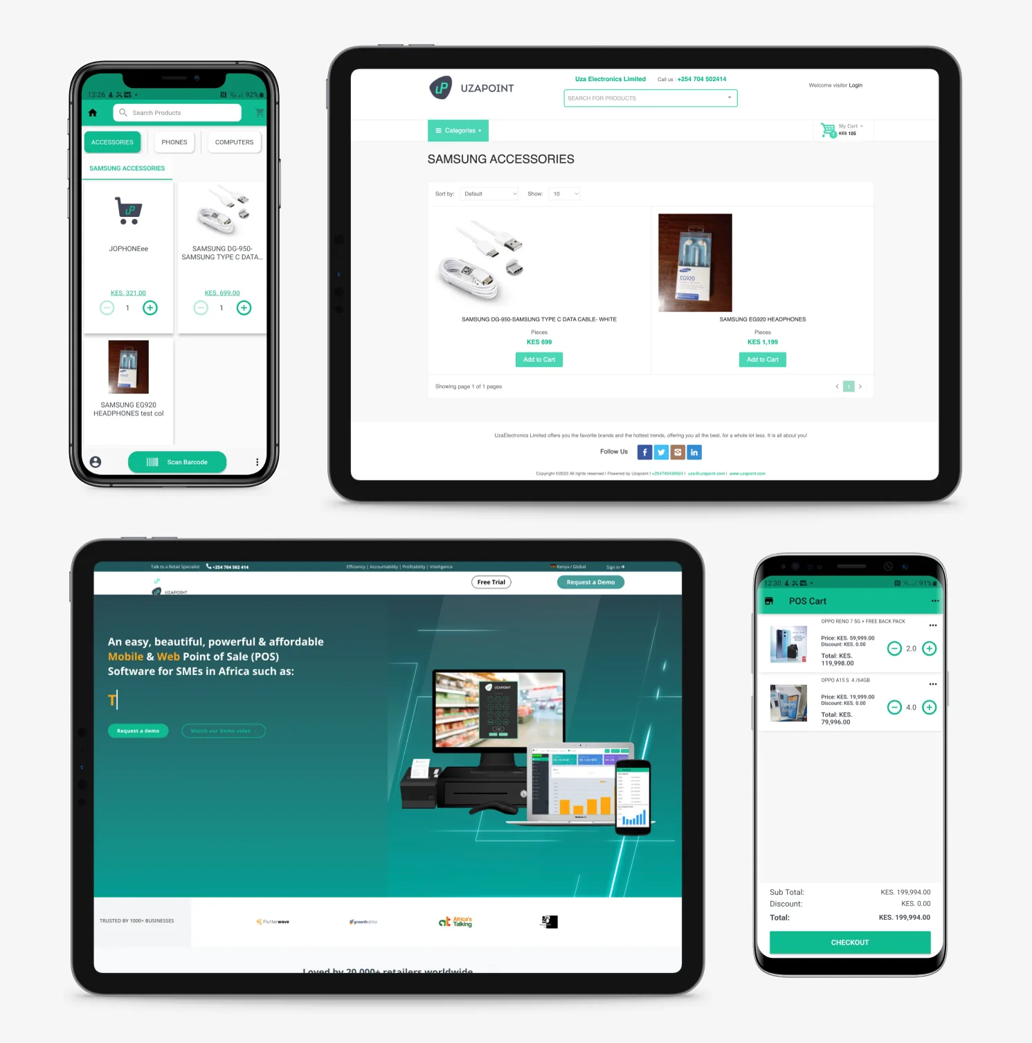
Rather than treating the project as a single interface redesign, the work covered four connected parts of the ecosystem: the eCommerce platform, the ePOS software, the commercial website, and the back office dashboard. Each platform served a different purpose, but together they needed to feel consistent, usable and commercially credible.
The eCommerce platform gave Uzapoint customers a branded way to sell their own products online. The ePOS software supported shopkeepers at the point of sale, helping them process transactions, manage inventory and keep daily operations moving. The commercial website acted as Uzapoint's public-facing shop window, explaining the proposition and building confidence with potential customers. The back office and dashboard gave business owners visibility of sales, stock, products, employees, performance data and quick actions in one place.
As the product designer, my responsibility was to bring clarity and consistency across this ecosystem. I focused on simplifying complex retail workflows, improving the user interface, strengthening the product experience and creating a more polished visual direction that could support Uzapoint's ambition to become a leading ePOS and retail-management platform in Africa.
eCommerce Platform
Branded online stores for customers to sell their own products.
ePOS Software
Till software for transactions, stock management and store operations.
Commercial Website
Customer-facing website to communicate the product offer and build trust.
Back Office & Dashboard
Sales, stock, product, employee and performance management in one place.
Methodology
The Double Diamond process.
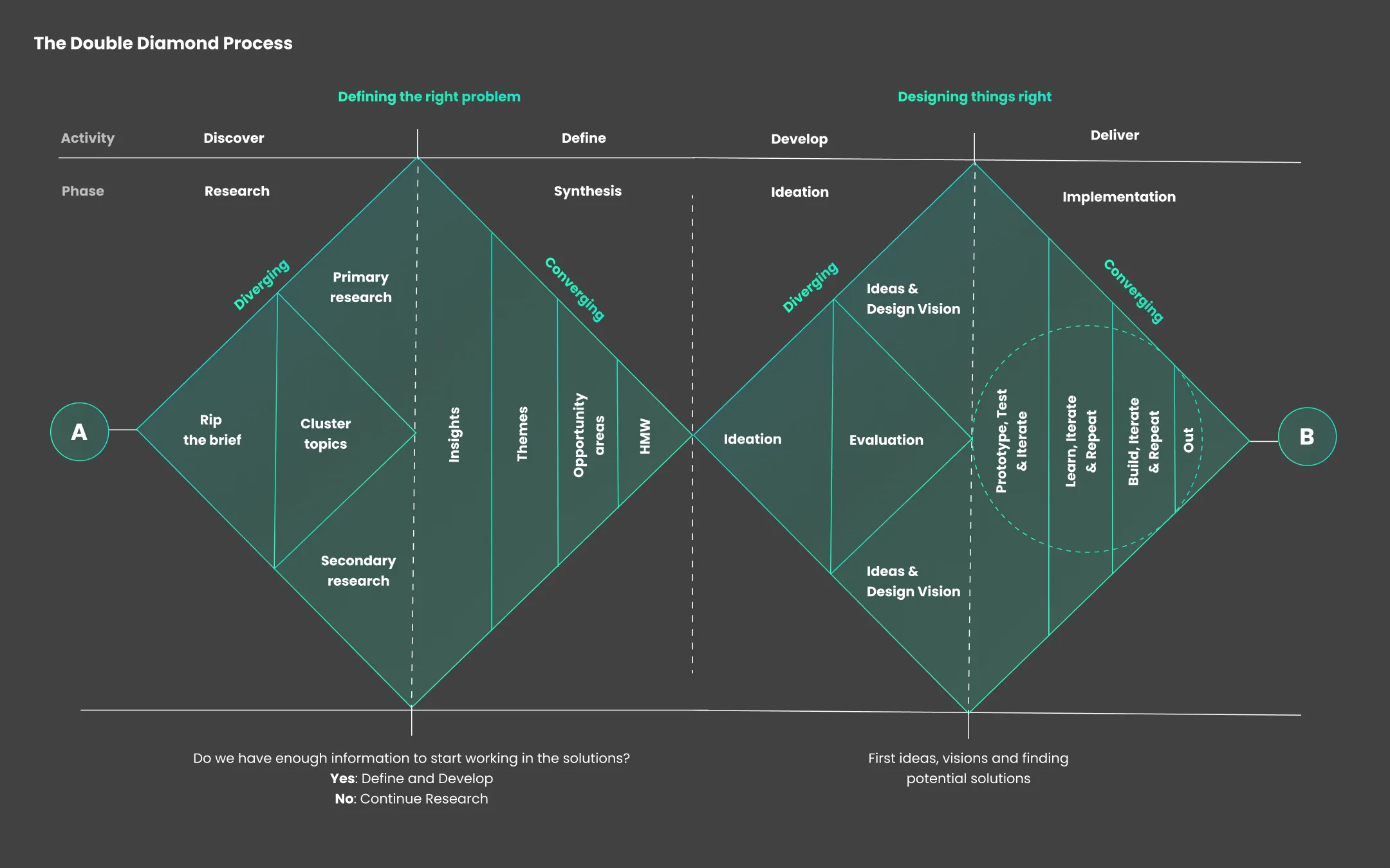
In tackling the Uzapoint project I adopted the classic Double Diamond process — a methodology consisting of four distinct phases: Discover, Define, Develop and Deliver. This approach ensured a thorough understanding of both the problem and the user, enabling a solution that was well-defined, user-centric and innovative.
Discover
Thorough research and discovery to understand the challenges with the existing ePOS system, leading to valuable insights that informed my strategy.
Define
Refined these insights into key themes, focusing on user needs to pinpoint the core problem — uncovering real user frustrations through consistent research.
Develop
Ideation led to numerous potential solutions, refining a viable design vision that balanced creativity with feasibility.
Deliver
Brought ideas to life through prototyping and testing, using feedback to refine the product so it exceeded user needs, expectations and technical requirements.
Discovery
Understanding the people behind the counter.
Who is the Customer?
The project centred on a broad range of retail users, from larger retailers to Duka and kiosk owners who play an essential role in local community retail across Africa. Many of these businesses provide everyday goods and services, often run by individuals supporting families and serving regular neighbourhood customers. Understanding their role, pressures and day-to-day needs helped shape a product experience that could support business growth, simplify operations and improve how they manage their stores.
Ethnographic Studies
Working with a research team based in Kenya, we explored how retailers operated in real-world shop environments through observations and interviews. I contributed by developing discussion guides and helping prepare the team for the research activities. The findings highlighted a clear need for a reliable, easy-to-use and affordable system that could streamline transactions, manage stock, surface useful insights and fit naturally into the fast-paced realities of African retail.



Competitor Analysis
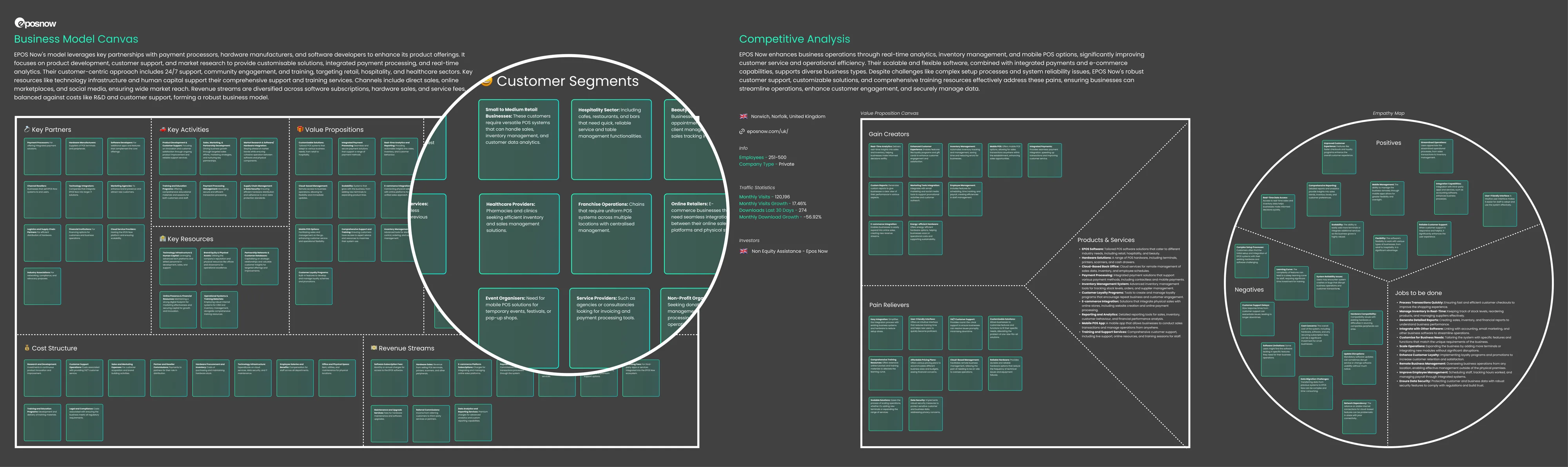
To position Uzapoint more competitively, I analysed both leading ePOS products from around the world and direct competitors operating in the same markets. This helped build a clearer picture of user expectations, common product patterns, and the gaps Uzapoint could use to differentiate itself.
I used three complementary tools in this process: the Value Proposition Canvas, the Empathy Map, and the Business Model Canvas. The Value Proposition Canvas helped me understand what competitors offered and where their strengths were most visible. The Empathy Map helped surface the customer perspective by drawing on reviews and observed pain points, shaping a more user-centred view of the market. The Business Model Canvas provided a broader understanding of how competitors operated, delivered value, and positioned themselves commercially.
This analysis sharpened Uzapoint's competitive direction. It strengthened my understanding of the category, aligned the product more closely with user needs, and highlighted clear opportunities for Uzapoint to stand out in the ePOS market.
Methods used
Value Proposition Canvas
Mapped what competitors offer, who they serve, and where their strengths create value for retailers.
Empathy Map
Used reviews and market signals to understand customer behaviours, frustrations, and expectations.
Business Model Canvas
Examined how competitors operate, generate revenue, and structure their products and services.
Define
Refining Product Requirements
After the discovery phase, I brought together insights from ethnographic research, competitor analysis and stakeholder workshops to define a clearer product direction for Uzapoint. The research had shown how retailers worked day to day, what they needed from their tools, and where the existing experience could be improved across the eCommerce platform, ePOS software, commercial website and back office.
I worked closely with Product Owners and stakeholders to turn these findings into practical product requirements. The workshops helped us align on user needs, business priorities, platform responsibilities and the behaviours each part of the ecosystem needed to support. This also helped shape early foundations for the design system, creating shared patterns, reusable components and clearer design principles across the different products.
The outcome was a more focused set of requirements that connected user insight with product strategy. Rather than redesigning screens in isolation, the work created a joined-up direction for a platform ecosystem that needed to feel easier to use, more scalable and better suited to the realities of retail businesses in African markets.
From insight to requirements
Research Inputs
Ethnographic research, user needs and competitor analysis.
Stakeholder Workshops
Alignment sessions with Product Owners and internal teams.
Synthesis
Patterns grouped across platforms, workflows and user goals.
Product Requirements
Clear requirements for eCommerce, ePOS, commercial site and back office.
Ideate
Moving from requirements to redesign direction.
Brainstorming and prioritisation
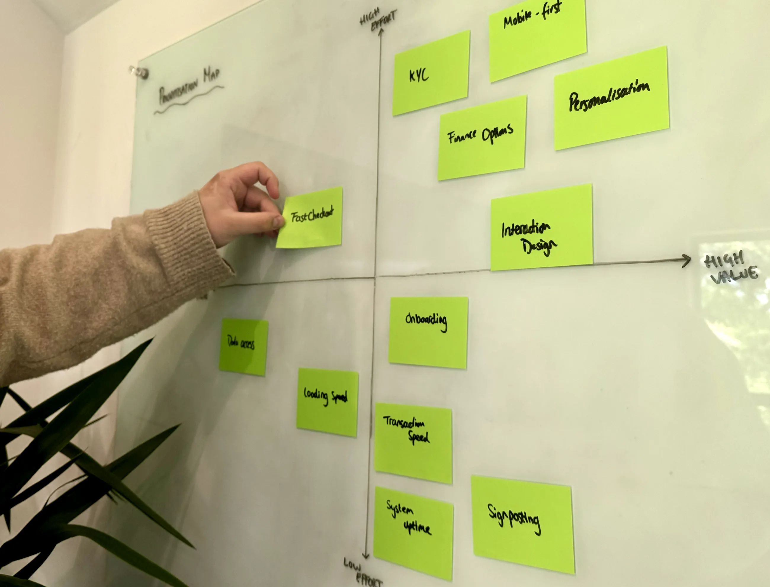
With the product requirements defined, the next step was to move from insight into direction. I facilitated brainstorming sessions with Product Owners, designers and key stakeholders to explore how the four platforms could be improved, while keeping the needs of retailers, internal teams and Uzapoint's wider business goals in focus.
Rather than jumping straight into screen design, we used these sessions to generate ideas, challenge assumptions and identify which opportunities could create the biggest improvement across the eCommerce platform, ePOS software, commercial website and back office.
Ideation workshops
Generated ideas across the four platforms, exploring how each part of the ecosystem could better support retailers, internal teams and day-to-day operational workflows.
Prioritisation mapping
Mapped ideas against user value, business impact, technical feasibility and effort to understand what should move forward first and what needed further exploration.
Design direction
Created a clearer direction for the redesign, giving the team a shared view of the most important opportunities before moving into visual design and interaction patterns.
Sketching
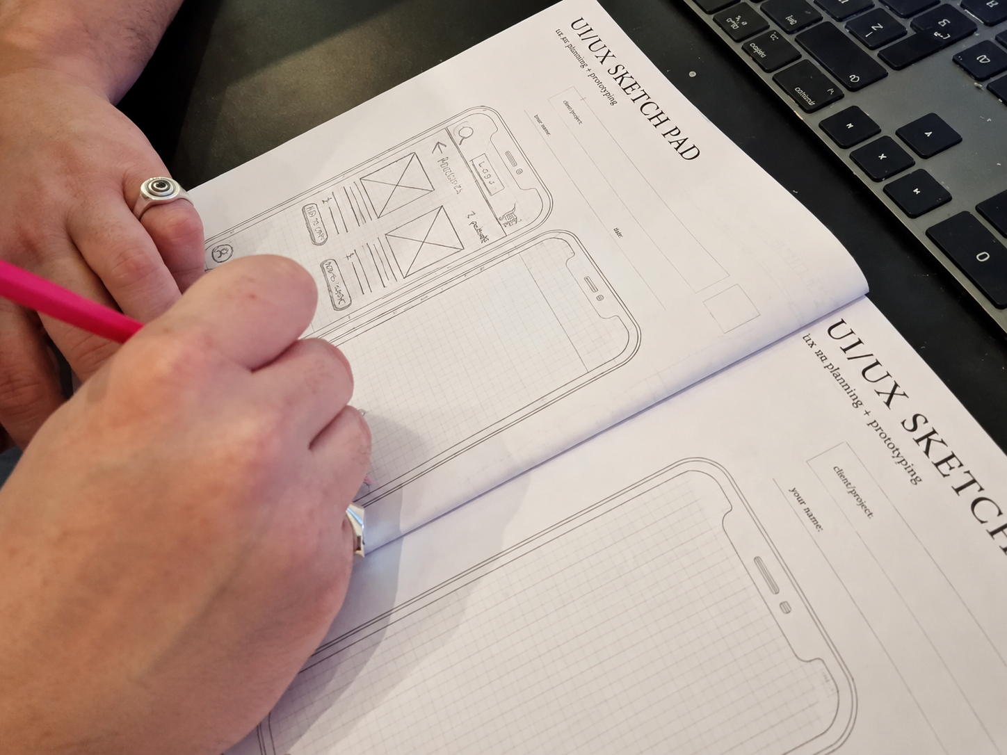
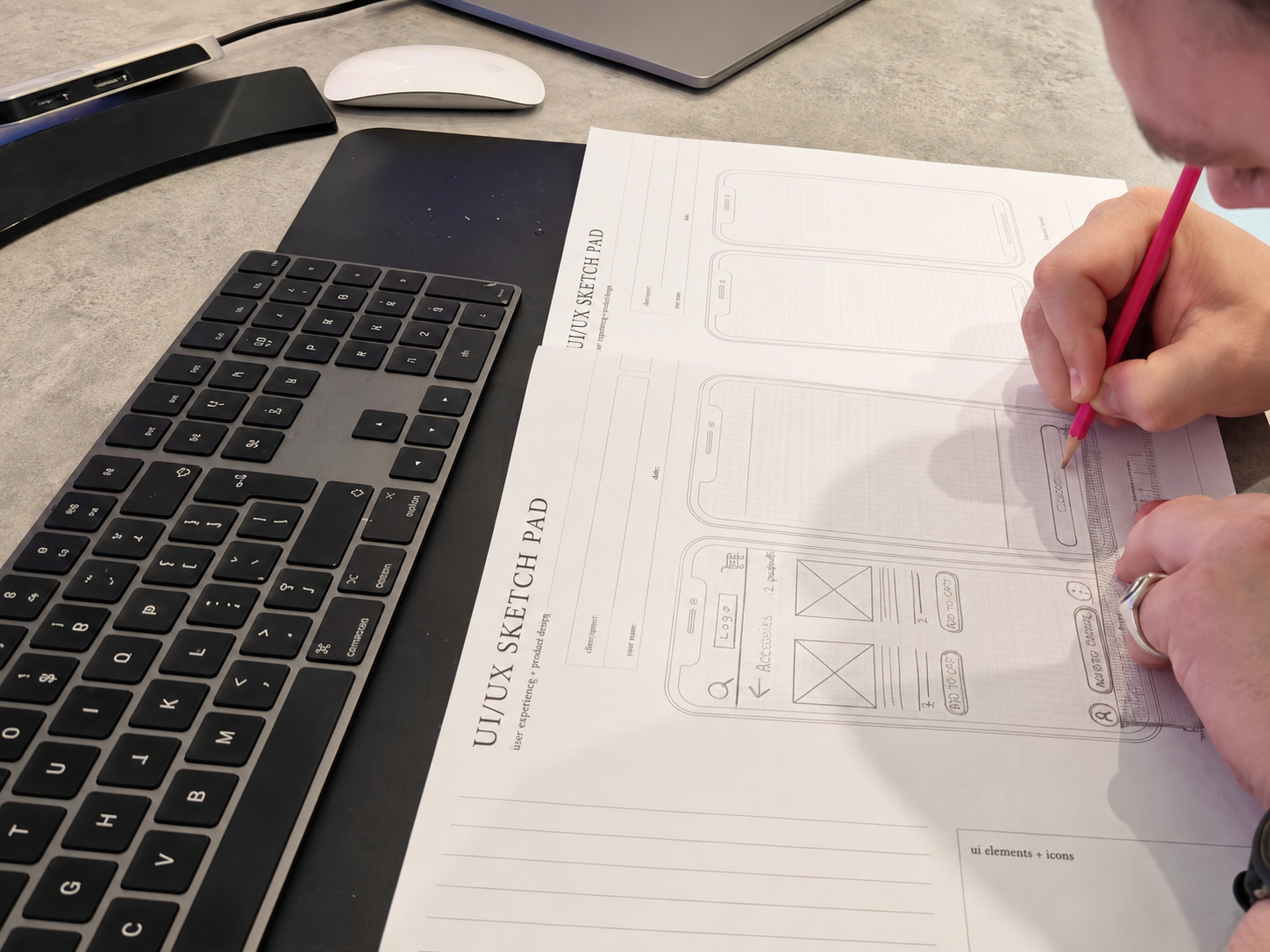
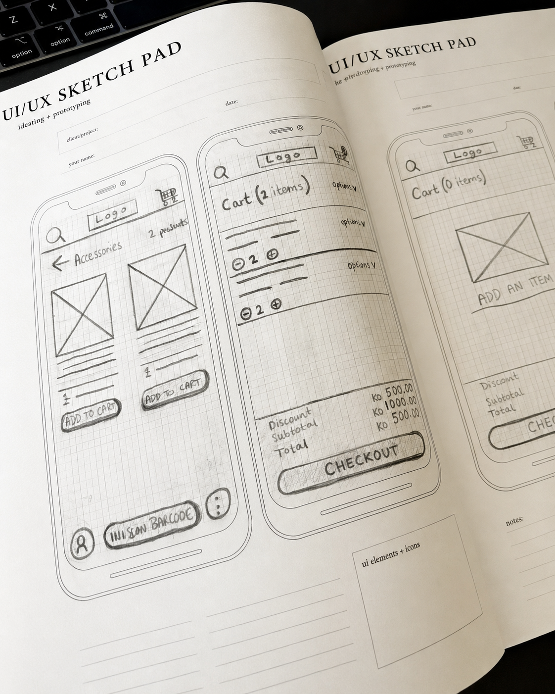
Sketching gave me a quick way to turn prioritised ideas into low-fidelity product thinking before moving into polished UI. At this stage, the focus was not on visual design. It was about solving the core UX problems first, testing structure, layout and flow, and understanding how each platform needed to work for different users.
I used sketching to explore the key journeys across the ePOS software, eCommerce platform and commercial website. For the POS, I focused on simplifying transactions and helping shopkeepers move quickly through common tasks. For the eCommerce platform, I explored how products, baskets and checkout could feel clear and easy to use. For the commercial website, the sketches helped shape how users would navigate, understand the offer and complete key actions.
This gave the team a faster way to review ideas before committing to detailed design. It also helped separate the experience problems from the visual layer, making sure the foundations were clear before creating reusable components, interface patterns and the design system that would support the wider product ecosystem.
Best Practices
I applied established UX principles and familiar interaction patterns to make the redesigned platforms feel clear, efficient and easy to learn. Rather than creating unnecessary complexity, the focus was on using proven conventions for navigation, product browsing, checkout, transaction flows and dashboard interactions.
This helped create a stronger foundation for the redesign, making each platform feel more consistent, reliable and scalable while still being tailored to the needs of African retail businesses.
Foundations
Building a Scalable Design System
Creating Uzapoint's design system began long before opening Figma. With only a set of brand guidelines to work from, my first objective was to gather requirements from key stakeholders to understand how the design system needed to support both the business and its users.
Through stakeholder workshops and collaborative discussions, I identified business goals, technical constraints, accessibility requirements and future product ambitions before auditing the existing product. This audit highlighted inconsistencies across colours, typography, spacing, navigation and interface patterns, helping to establish a clear vision for a scalable and consistent design system.
From this discovery, I defined the foundations of the system, establishing design principles centred around accessibility, consistency and flexibility. Rather than designing individual screens in isolation, I created reusable foundations including colour tokens, typography, spacing and layout rules before building a scalable component library.
Every decision was validated against WCAG accessibility standards to ensure the platform remained usable for all users. Particular consideration was given to Uzapoint's primary user base across Africa, where research highlighted a higher prevalence of visual impairments, as well as the real-world environments in which the platform would be used. Many users operate within dimly lit retail stores and warehouses, so the design system prioritised high contrast, clear visual hierarchy, legible typography and accessible interaction patterns to ensure the interface remained usable and effective regardless of lighting conditions.
The design system was built as a single source of truth within Figma, using shared styles, reusable components and design tokens to create consistency across the product. This enabled seamless collaboration between design and development, allowing future updates to cascade throughout the platform while reducing duplication, accelerating delivery and creating a scalable foundation capable of supporting new features without compromising the user experience.
Colour Palette
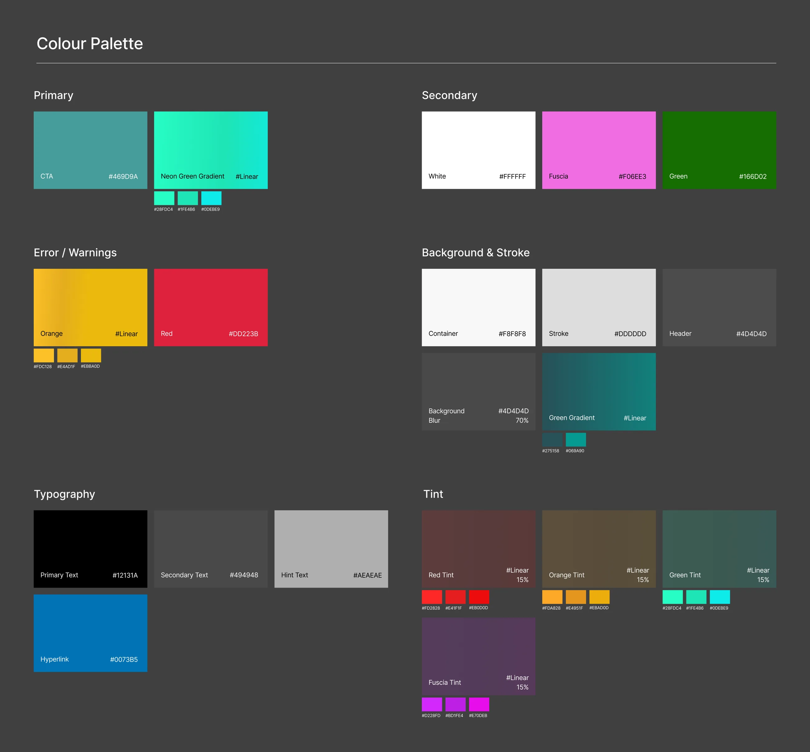
Rather than simply selecting colours from the brand guidelines, I established a scalable colour system that balanced brand recognition with usability. Primary, secondary and semantic colours were defined with accessibility in mind, ensuring sufficient contrast ratios for WCAG compliance whilst creating clear visual hierarchy throughout the platform. The palette was designed to scale consistently across marketing, web and product experiences, providing a flexible foundation that could support future growth without sacrificing consistency or usability.
Type Scale
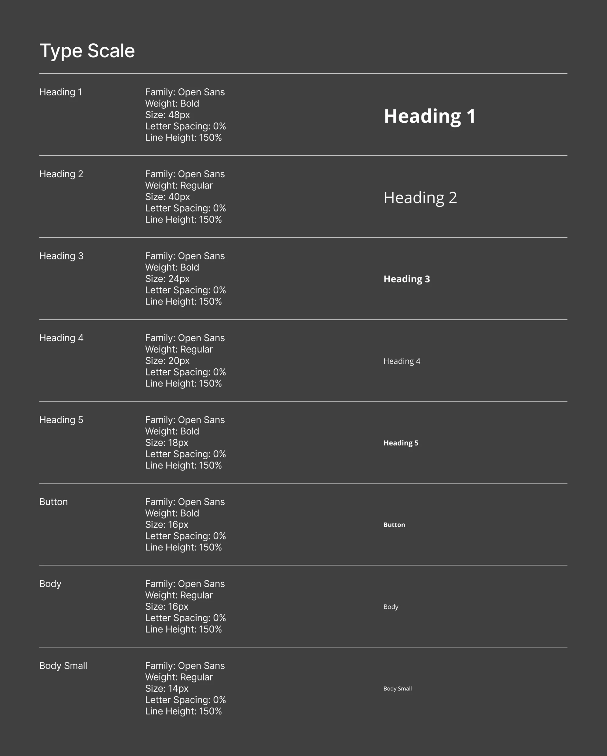
Typography was developed as a structured type scale rather than a collection of individual font sizes. Open Sans was selected for its readability across devices and screen sizes, with clear hierarchy established for headings, body copy, labels and supporting text. Consistent sizing, spacing and font weights ensured content remained accessible whilst improving scanability and maintaining visual consistency throughout the product.
Component Library
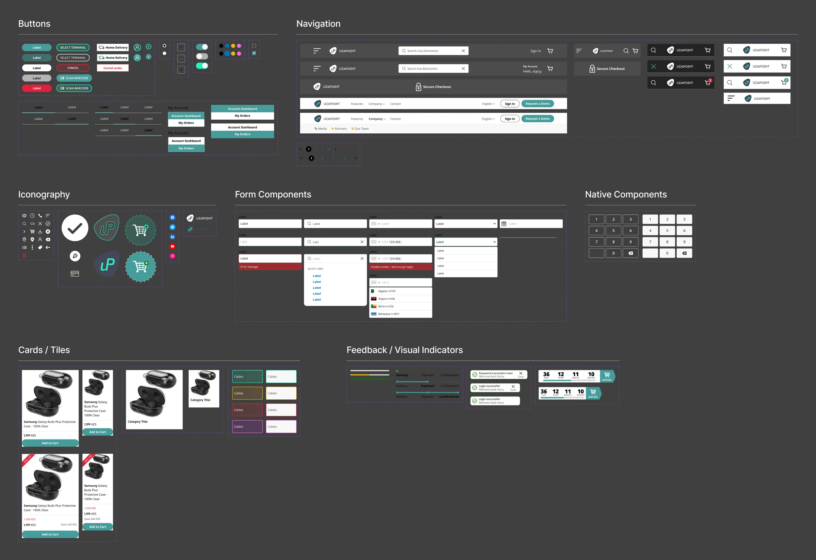
With the design foundations established, I created a reusable library of components covering navigation, forms, buttons, cards and interactive elements. Each component was designed with multiple variants, responsive behaviours and interaction states, alongside clear usage guidance to ensure consistent implementation by both designers and developers.
To support long-term adoption, every component was documented with usage guidelines, accessibility considerations and implementation notes, creating a shared understanding of when and how each component should be used. Building the library around reusable components significantly reduced design duplication, accelerated feature delivery and provided a scalable framework that ensured future experiences remained consistent across every touchpoint.
Redesign
E-commerce Platform
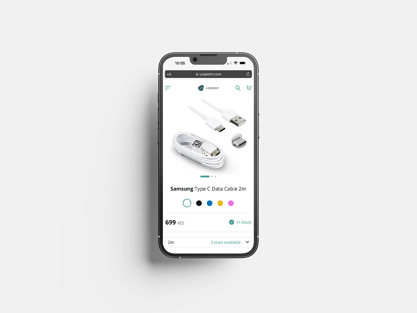
The eCommerce platform was designed as a white-label product that Uzapoint could offer to its retail customers, giving each business a way to launch its own branded online store and sell beyond the physical shop counter. Following the discovery, requirements and sketching phases, the focus was on turning the needs of small retailers into a storefront that was simple to manage, easy for customers to browse and flexible enough to support different product types, stock levels and business needs.
This part of the redesign focused on making the end-to-end shopping journey feel clear and friction-free, from product discovery through to checkout. I applied the shared design system foundations, interaction patterns and UX principles established earlier in the project, while tailoring the experience to different retailer brands. Because each storefront ran on the same underlying Uzapoint platform, performance and behavioural events could also be measured consistently across the white-label experience.
Platform impact
+35%
FASTER STORE SETUP
+24%
CHECKOUT COMPLETION RATE
+53%
PAGE LOAD PERFORMANCE
Simplified Navigation
I simplified the site structure so customers could browse categories, view products and move through the shopping journey without unnecessary friction. The aim was to make the experience feel familiar, quick to understand and easy to use for both new and returning shoppers.
Clear Purchase Actions
Calls to action were placed around the moments where customers needed to make decisions, including product selection, basket review and checkout. This helped reduce hesitation and made the next step in the journey clearer.
Accessible Product Experience
The interface was designed with clear hierarchy, readable typography, consistent spacing and accessible contrast. This helped keep product information easy to scan, especially on mobile where many customers would be browsing and purchasing.
UX principles applied
Law of Proximity
Related product information, pricing, variants and actions were grouped close together so customers could understand each item quickly and make decisions with less effort. This was especially important on mobile, where product images, price, stock status, variant choices and add-to-cart actions needed to feel connected without overwhelming the page.
Law of Common Region
Cards, borders and spacing were used to visually connect product content, categories and shopping actions. By containing related information within clear regions, the storefront became easier to scan, helping users understand what belonged together and move through browsing, product selection and checkout with more confidence.
Aesthetic-Usability Effect
The storefront used a cleaner, simpler visual structure so the experience felt more trustworthy, easier to understand and less overwhelming for customers. This helped small retailers present their products in a more polished way, while making the shopping journey feel more intuitive and credible for end users.
Fitts's Law
Key actions such as product selection, variant choices and checkout controls were made easier to reach and use on smaller screens. Larger touch targets, clearer spacing and prominent calls to action supported faster browsing and purchasing on mobile devices, reducing friction at the most important points in the journey.
Redesign
ePOS Software
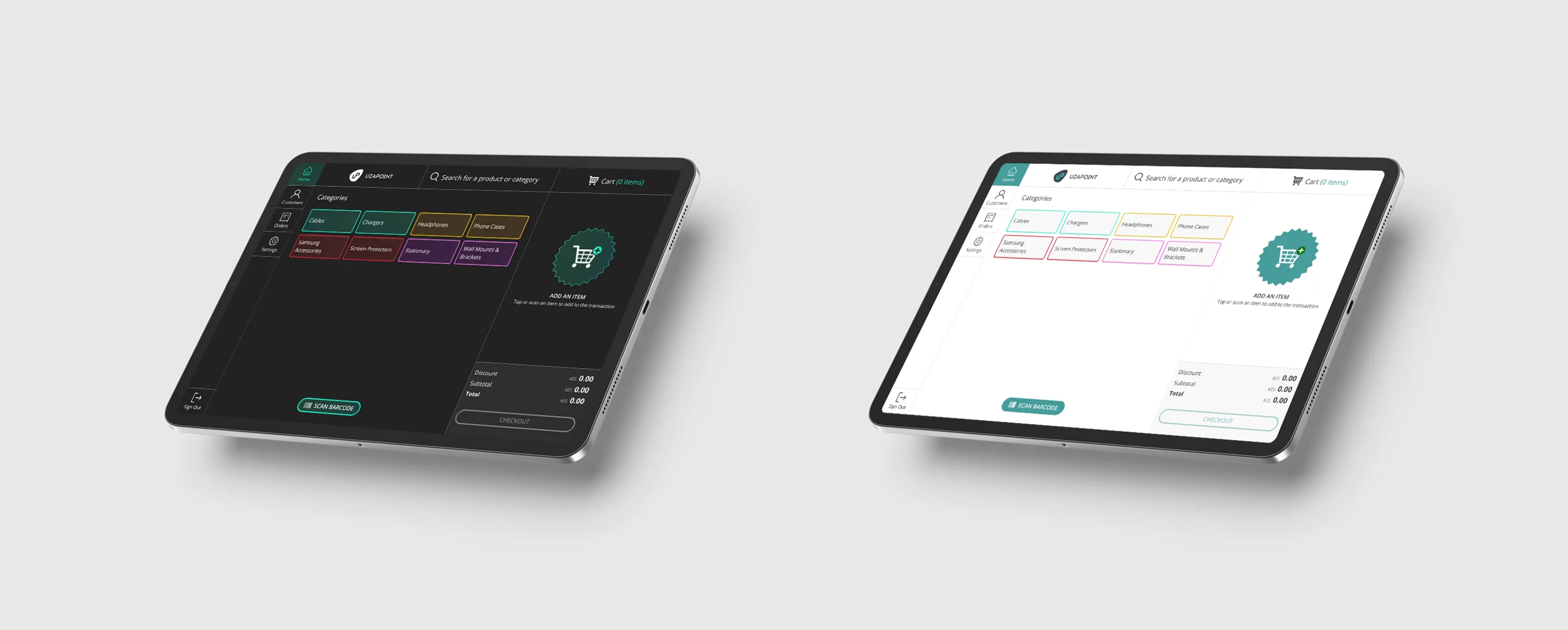
Uzapoint's ePOS software sat at the centre of the retail ecosystem. It was the tool shopkeepers used to process transactions, manage stock, track sales and keep day-to-day operations moving. Following the discovery, requirements, sketching and design system work, the goal was to redesign the ePOS experience so it felt faster, clearer and more reliable in busy retail environments.
The design focused on reducing cognitive load during high-frequency tasks. Shopkeepers needed to find products quickly, move through sales without hesitation, understand stock and pricing information at a glance, and trust the system in different store conditions. This meant applying familiar interaction patterns, clearer hierarchy and adaptive visual modes that could support both bright storefronts and dimly lit spaces.
Platform impact
+48%
Transaction Speed
−62%
Error Rate Reduction
Reduced Cognitive Load
The interface was designed around the tasks shopkeepers repeated most often, including searching products, adding items, reviewing baskets and completing transactions. Clear grouping and familiar patterns helped users move through each step quickly without having to relearn the system.
Clearer Interaction Cues
Visual hierarchy, spacing, contrast and colour were used to make key actions easier to recognise. This helped guide attention towards product categories, basket activity, totals and checkout actions, reducing uncertainty during fast-paced retail workflows.
Adaptive Visual Modes
Light and dark modes were introduced to support different shop environments, from bright storefronts to dimly lit counters. This improved legibility, made the interface more comfortable to use and helped the product feel more robust across real retail settings.
UX principles applied
Law of Proximity
Commonly used actions were grouped close to the areas where users needed them most. For till software, this was especially important because shopkeepers repeat the same actions hundreds of times a day, such as searching products, adding items, changing quantities, applying discounts and completing checkout. Placing these controls in prominent, predictable areas reduced unnecessary movement and helped speed up transactions.
Jakob's Law
The interface reused familiar retail and point-of-sale patterns so users did not have to relearn basic behaviours. Key pages followed consistent layouts, with actions, navigation, product lists and checkout controls appearing in expected places. This helped users build muscle memory and move confidently between different parts of the system.
Fitts's Law
High-frequency actions were designed to be easy to access and interact with, especially on touch devices. Primary actions such as adding products, scanning barcodes and completing checkout were given clear, tappable areas to reduce errors and make the system easier to use in busy retail environments.
Hick's Law
The redesign reduced decision overload by simplifying choices at each stage of the transaction flow. Instead of showing too many competing actions at once, the interface prioritised the most relevant options for the user's current task. This helped users move faster, stay focused and complete sales with less hesitation.
Redesign
Commercial Site
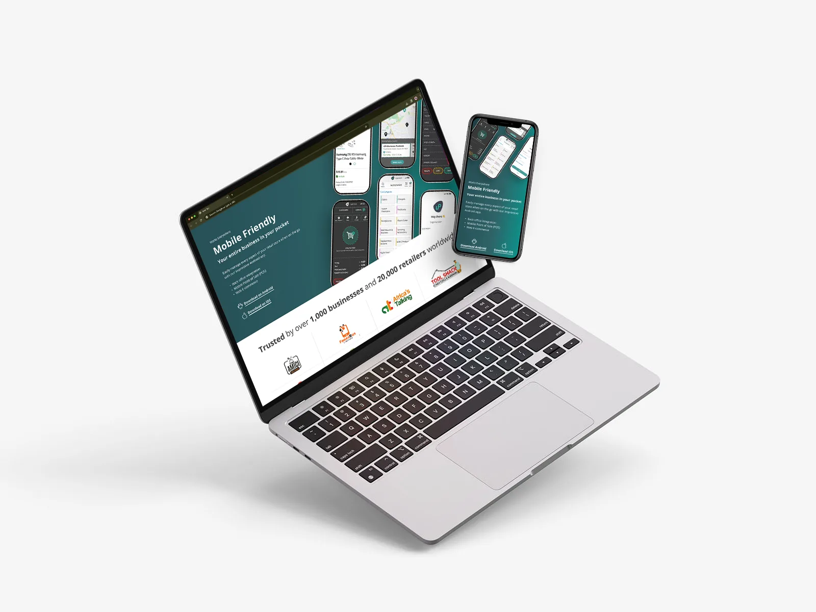
The commercial site was Uzapoint's customer-facing website, designed to explain the product offering, build trust and help potential customers understand how the platform could support their retail business. Following the discovery and requirements work, the redesign needed to move the site away from a dated, text-heavy experience and towards something clearer, more credible and easier to navigate.
The focus was to balance storytelling with practical product information, helping users quickly understand Uzapoint's value across retail automation, ePOS software, eCommerce and back-office management. I applied the same design system foundations used across the wider platform, creating a cleaner visual hierarchy, stronger calls to action and a more engaging responsive experience.
Platform impact
+43%
User Engagement
+31%
Conversion Rates
−42%
Bounce Rates
+38%
Mobile Traffic
The Challenge
The original site contained useful information, but it was difficult to scan and did not clearly communicate the value of Uzapoint's wider product ecosystem. The redesign needed to help prospective customers understand the offer quickly, while giving the brand a more polished and trustworthy digital presence.
The Process
I reviewed the existing site structure, content hierarchy and key user journeys to identify where the experience could be simplified. The redesign focused on clearer navigation, sharper messaging, stronger visual storytelling and more purposeful content blocks that guided users towards key actions.
Design Improvements
I created a cleaner, more responsive interface with improved spacing, clearer calls to action and stronger visual hierarchy. The content was organised around what users needed to understand first, reducing clutter while still giving enough depth to explain Uzapoint's products and benefits.
The Outcome
The redesigned commercial site gave Uzapoint a clearer and more engaging way to present its platform. It helped connect the brand story with the wider product suite, improved usability across devices and created a stronger first impression for prospective customers.
Redesign
Back Office & Dashboard
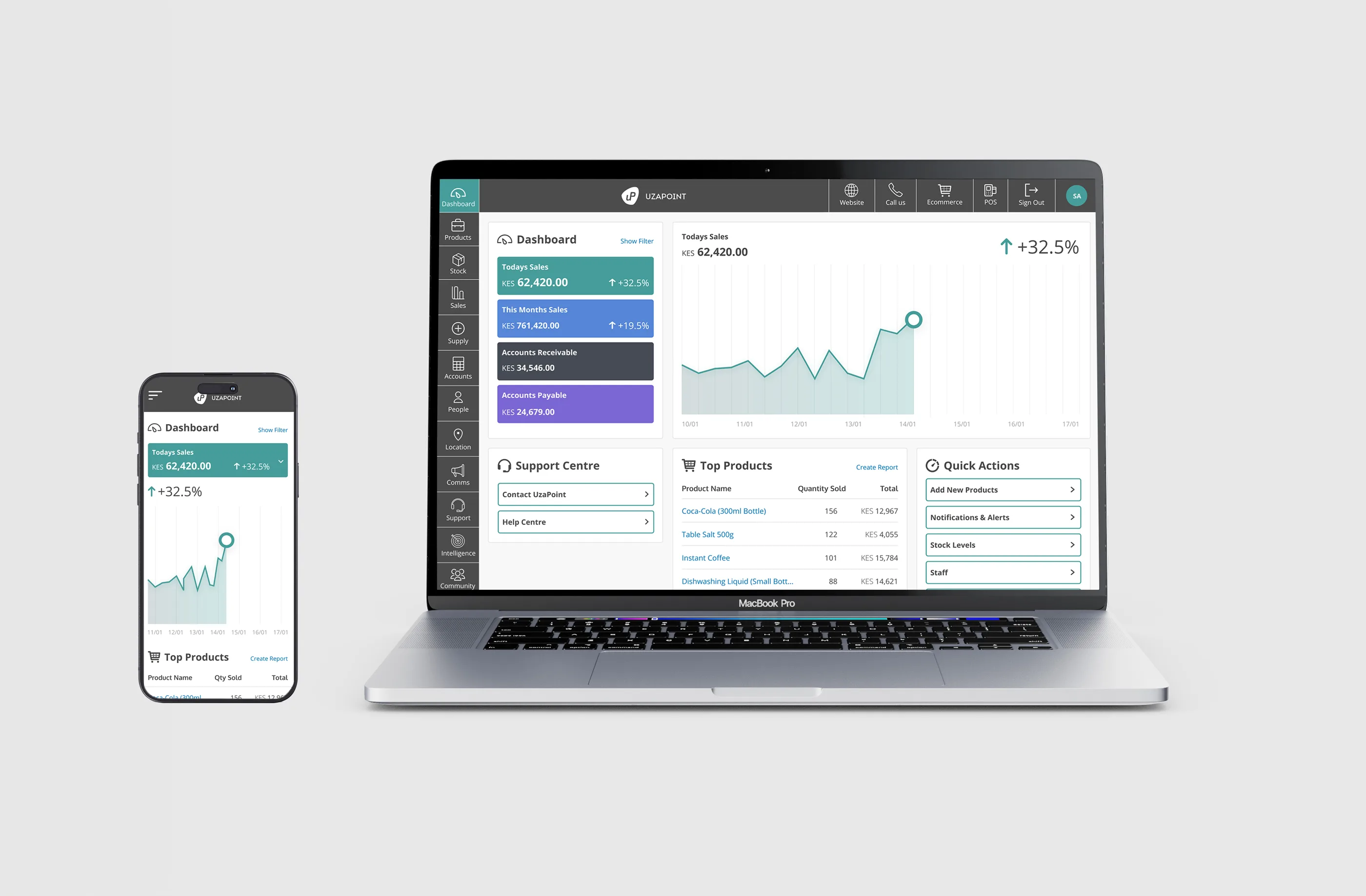
The back office and dashboard gave Uzapoint's retail customers a central place to manage the operational side of their business. While the ePOS supported day-to-day transactions and the eCommerce platform enabled online selling, the back office needed to help business owners understand performance, manage stock, add products, oversee employees and make better decisions from one place.
Following the research, requirements and sketching phases, the redesign focused on turning complex business information into a clearer management experience. I designed the dashboard around the information users needed most at a glance, including sales, stock, top products, account balances and quick actions, while making the wider back-office navigation easier to understand and move through.
Platform impact
+22%
Task Completion Rate
−66%
Interaction Errors
Clearer Navigation
The back office needed to support a wide range of tasks without feeling overwhelming. I simplified the side navigation and grouped related areas more clearly, helping users move between products, stock, sales, employees and dashboard tools with less friction.
Dashboard at a Glance
The dashboard was designed to give users a fast overview of business performance. Key information such as today's sales, account balances and top products was surfaced clearly, helping owners understand what was happening in their business without digging through multiple sections.
Data Visualisation
I used visual summaries and sales graphs to make performance data easier to interpret. The aim was to help users spot trends, understand changes in sales and make quicker decisions without needing advanced reporting knowledge.
Quick Actions
Common actions were made easier to access from the dashboard and back office experience. This supported faster workflows for tasks such as adding products, checking stock, reviewing sales and moving between key management areas.
Cross-Device Management
The interface was designed to work across devices so business owners could manage operations beyond the shop counter. This made the back office more flexible for users who needed to check performance, update information or manage their business while on the move.
Operational Visibility
The old design was missing several features that business owners needed to manage their operations confidently. I introduced clearer visibility across sales, stock, products, employees and dashboard activity, helping users understand what was happening in their business at a glance. This improved the overall UX by turning the back office from a basic management area into a more useful operational tool.
Delivery
Validating the redesign in real retail environments.
After the platform designs had been developed, I moved into prototyping, testing and refinement. The aim was to validate the redesigned experiences across the eCommerce platform, ePOS software, commercial site and back office, making sure each product worked as part of a connected ecosystem rather than as separate screens.
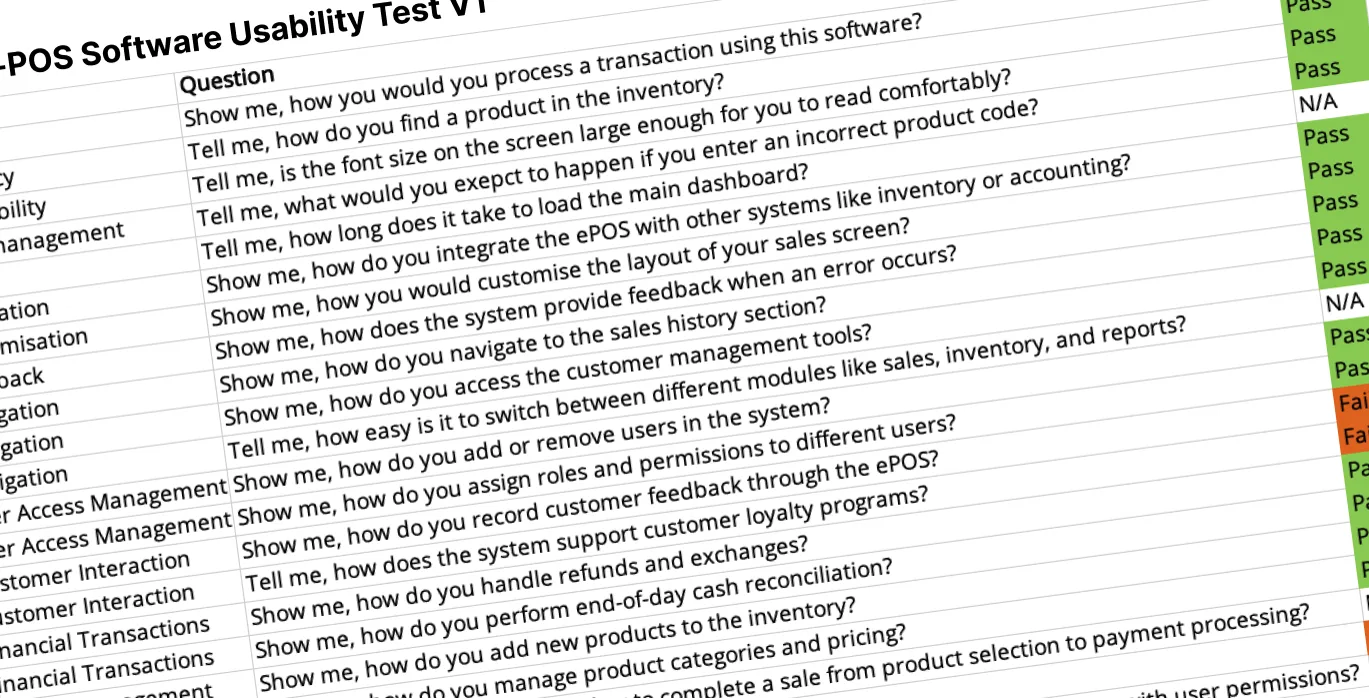
Testing took place across a mix of remote sessions and real retail environments. Some users reviewed prototypes online, while members of the research team in Kenya carried out usability studies with retailers in their own stores. This helped us understand how the designs performed in the conditions they were intended for, including busy counters, repeated transactions, stock-management tasks and everyday business workflows.
Validation approach
Prototype Validation
I used interactive prototypes to test key journeys across the eCommerce platform, ePOS software, commercial site and back office before moving into final refinement.
Usability Testing Framework
I created usability testing guides and task-based scripts so the team could capture feedback consistently across core journeys such as processing transactions, finding products, managing inventory, reviewing sales data and navigating between modules.
Real-World Testing in Kenya
The Kenyan research team carried out usability studies with retailers in their own stores, helping us understand how the experience worked in real operating conditions rather than only in controlled testing sessions.
Refinement with Developers
I worked closely with the development team to translate feedback into practical improvements, refining flows, interface details and interaction patterns so the final experience felt easier to use and better suited to small retail businesses.
Outcome
A clearer platform ecosystem for growing retailers.
The final work brought together research, stakeholder alignment, product requirements, design system foundations, platform redesign and usability testing into a more joined-up product ecosystem for Uzapoint.
Across the eCommerce platform, ePOS software, commercial site and back office, the redesign focused on making everyday retail tasks easier to complete. Shopkeepers could process sales more confidently, manage stock more clearly, understand business performance at a glance and create branded online stores that extended their reach beyond the physical counter.
The project also helped establish a stronger design foundation for Uzapoint, with clearer patterns, reusable components and a more consistent experience across multiple products. Instead of treating each platform as a separate interface, the work created a connected system that could scale with the needs of retailers and the business.
Connected ecosystem
A more consistent experience across eCommerce, ePOS, commercial site and back office.
Improved retail workflows
Core tasks were made clearer, faster and easier to complete in real working environments.
Stronger design foundation
Reusable patterns and components created a more scalable base for future product work.