Case Studies/GFK

Enhancing an enterprise experience.
A digital revamp of WebTas, a key tool within GfK's data platform.
Timeframe
9 months
Location
Remote
Engagement
Agency Contract
Role
Product Designer
The product
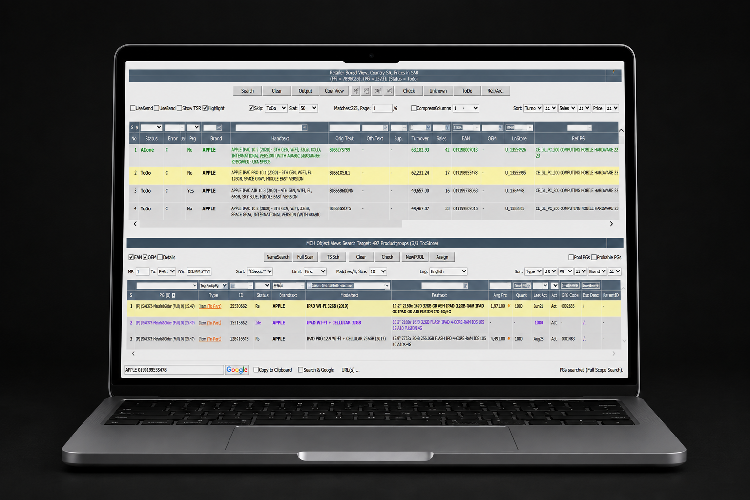
WebTas overview
WebTas is the go-to software for manually pairing new products with existing data. While the machine-learning algorithm auto-matches some products, it succeeds only 12% of the time, so a whopping 1.8 million products each year still need human oversight.
Built by engineers for engineers, WebTas has served GfK loyally for 24 years. It's not just another tool. It's respected legacy software at the heart of GfK's plans to modernise with a focus on user experience.
The brief
Project scope
On average, a WebTas user spends 1 minute 34 seconds matching each new record with existing data.
The goal
Reduce that time. We set out to improve performance by aligning systems and user workflows across different areas, the initial step in GfK's digital transformation, aiming to boost the client experience.
What I did
I was involved in research planning, journey mapping, brainstorming ideas, designing and testing concepts, owning the end-to-end design process across the engagement.
Phase 01
Discovery
Approach & context
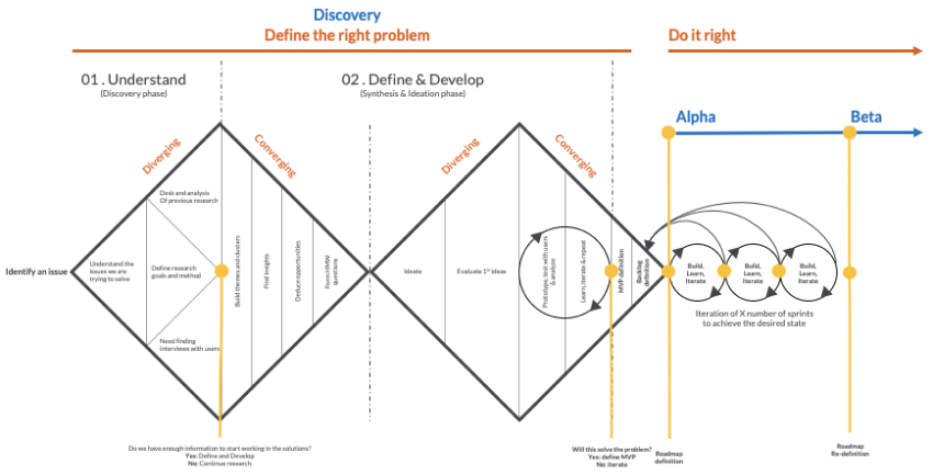
During discovery I combined research methods inspired by the classic human-centred design double diamond. The research involved 23 participants from three countries across two continents. I gathered questions from the product-management team and used them in a digital survey sent to 900 users, with a healthy 8.5% response rate.
User interviews
I set up and led interviews with WebTas users. This was the first time they actively shared feedback with GfK. The team initially nominated mainly experienced, English-speaking users; noticing this bias, I urged stakeholders to include a broader range.
Using a semi-structured guide and a "show and tell" method (with permission to record), the interviews surfaced user habits, pain points and the technology they relied on, shaping WebTas's future plans.
Surveys
Alongside interviews, I launched a worldwide survey in Qualtrics with clear questions based on the PACT framework to understand users' backgrounds. I followed ethical guidelines: informed consent, privacy, and the freedom to leave at any time.
Out of 900 users across two continents, we received 77 responses, which my team turned into clear visuals to guide WebTas's next steps.
What we learned
Survey insights
90%
Prefer a linear workflow
85%
Show adaptability to change
85%
Are proactive problem solvers
51%
Maintain strong task focus
60%
Value individuality & sharing
100%
Consider themselves analytical
WebTas operates within three main settings, each shaping how users work:
Physical setting
Users access WebTas from quiet home offices to busy workspaces. Some faced disrupted services from extreme weather; home users often struggle with shared or slow Wi-Fi versus reliable office connections, underlining the need for WebTas to work well remotely.
Organisational setting
WebTas serves users across time zones in India, Malaysia, Bulgaria and Germany, creating communication challenges. Tools like MS Teams resolved certain issues, especially in remote settings.
Social setting
When problems arise, users have few self-help options and usually turn to managers or seasoned colleagues. Office support is stronger, but there's a clear need to upgrade support mechanisms to improve the overall experience.
Synthesis
Design insights
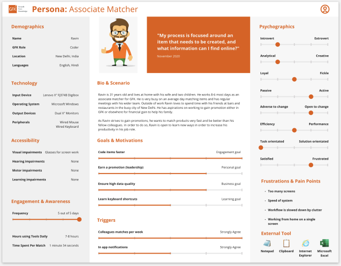
I developed three key tools that shed light on user needs and kept me committed to a tailored experience: personas, user journeys and user stories.
Personas
The personas I crafted offer a window into user behaviours, motivations and skills. As the research deepened, they evolved, helping the team empathise with users. Each combined demographic and psychographic detail, kept realistic and free from bias.
User journeys
User journeys help us grasp how people act. In the sessions I led, I captured how users moved through WebTas and matched data in a broader context. Each journey was simplified, labelled and paired with user comments, revealing where GfK could do better and what the main goals should be.
User needs & a heuristic review
WebTas needed to be more accessible, an immediate priority, as over 20% of users have a visual impairment. To map the experience precisely, I ran a heuristic evaluation against Jakob Nielsen's 10 usability guidelines, identifying strengths and areas to refine.
Heuristic findings
- Proactive onboarding features are lacking.
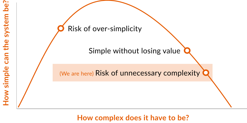
- Interface clutter and a dated aesthetic undermine usability.
- Product filters promote recognition over recall, which is a strength.
- Keyboard shortcuts and user-defined filters offer good flexibility.
- Tabs give clear visibility of system status.
- Unconventional navigation creates user-control and freedom issues.
- Inconsistent iconography and text sizing weaken information hierarchy.
Diving deep with a cognitive walkthrough
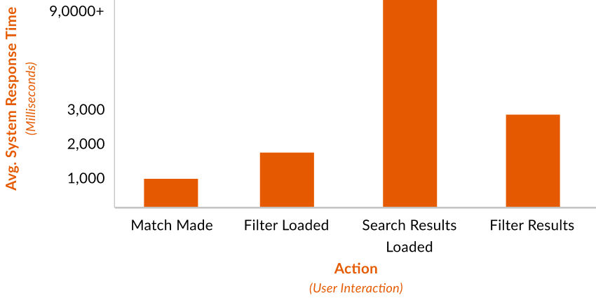
I grouped users by persona and matching method (evident from system-usage data), giving each group specific tasks via clear, step-by-step actions. The aim: swift, effective product matching.
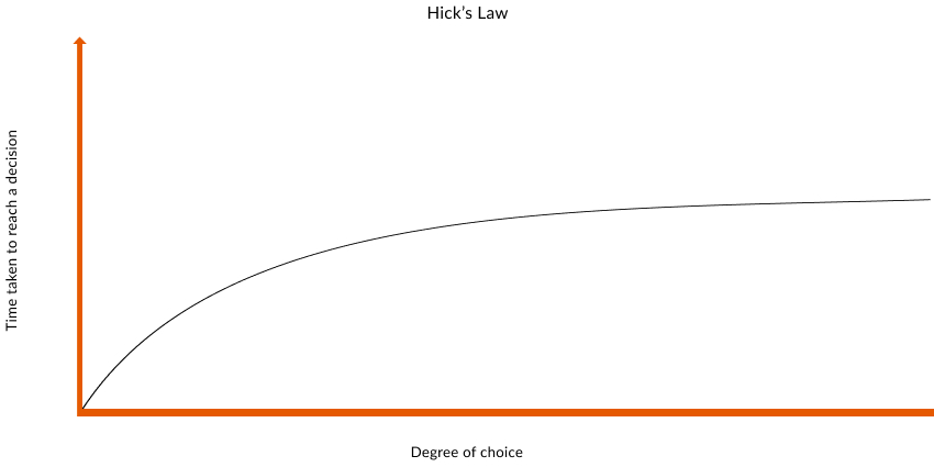
Throughout, I kept asking: Is the goal clear? Is the next step obvious? Can users see the results of their actions, and spot any issues? The insights broadened the journey's scope for every team, enhancing the experience while aligning with GfK's broader objectives.
Phase 02
Ideation
Sketching
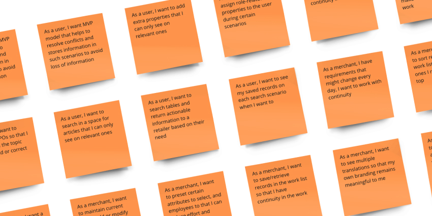
Understanding users and their challenges, I moved into ideation, rooted in making everything user-friendly and accessible. In collaborative workshops with experts and stakeholders, we shaped the future of WebTas, and sketching began.
I prioritised accessibility, ensuring colours were easily distinguishable for the 20% of users with visual impairments, and sticking to top-tier contrast standards. I rethought the interface language, avoiding confusing abbreviations.
I kept familiar designs like the top and bottom tables (aligning with Gestalt principles), and added a feature showing the order in which items will be processed, reducing confusion and making the system even more user-friendly.
Phase 03
Design
With insights from discovery and ideation, and a clear product vision, the focus shifted to design. I turned broad ideas into real, user-focused solutions, building a unified design system and developing detailed wireframes in Figma.
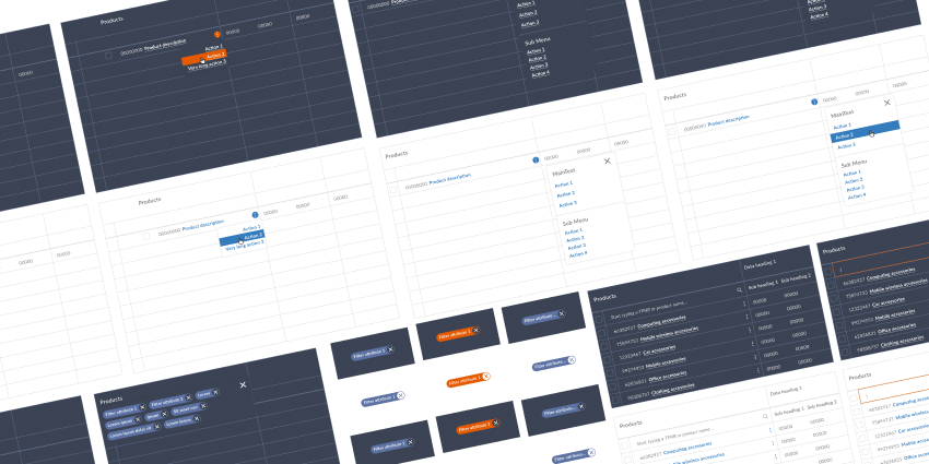
GfK design system
With earlier insights in hand, I created a flexible atomic design system. It reflected the GfK brand's look and feel, with guidelines set to boost the user experience.
High-fidelity wireframes
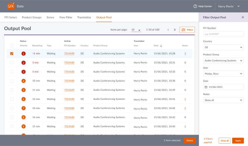
High-fidelity wireframes take abstract ideas one step closer to the real product. Using Figma Informed by user insights and the design system, I crafted detailed wireframes that gave the design a solid feel and connected initial ideas with how they'd actually work.
Phase 04
Delivery
Prototyping
Prototyping was crucial in shaping designs, a clear lens to test ideas. Through hands-on usability tests and a "show me, tell me" approach, I understood where the design stood out and where it needed work.
I used Axure RP to build prototypes that felt close to a final product, so participants' feedback was more reliable. I also focused on the micro-interactions, the small details that make the experience richer and more enjoyable.
Usability testing
I developed a semi-structured discussion guide that was consistent yet flexible enough to explore unforeseen issues, with sections for introduction, warm-up, main inquiries, feedback and wrap-up.
My focus was the product's user-friendliness: font style, size, contrast and the integration of upcoming features, evaluating how well the changes aligned with users' daily tasks.

Outcome & reflection
“The continuous loop of feedback and redesign fostered a product that was not only more intuitive but more aligned with the practical realities of our users' daily operations.”
The end of this phase marked a significant milestone in the journey towards an optimal user experience, setting a strong foundation for future enhancements to WebTas.
58 seconds
Average matching time after the redesign
Matching time reduced from 1 minute 34 seconds to 58 seconds per record. The redesigned workflow reduced the time needed to match a new record with existing data, making one of WebTas's most repetitive tasks faster and more efficient.